CURRENT STATUS, 8 Sept 2026: The tutorial is now complete! Nevertheless, I will continue to update this as I learn, and as folks ask questions. My process is far from perfected, but it’s damn close now!
I’m going through the process of figuring out the right way to set up my photogravure practice using a technique direct-to-plate (DTP), in which you print etching masks directly onto photopolymer plates with an inkjet printer. And if you’re here, I bet you’re struggling like I have been. This is where I am documenting what I’ve learned in the hopes of creating something repeatable that you can use for yourself.
Please note that this document is a work in progress, and is currently incomplete. I’ll update as I go, and your feedback is always welcome!
What are we doing again?
In DTP photopolymer intaglio, you print a positive image directly onto an unexposed polymer plate using UV-opaque inkjet ink. Where ink lands, it blocks UV light during exposure; the polymer underneath stays soft and washes out in water, becoming the ink-holding recesses of the intaglio plate. Where there’s no ink, UV light hardens the polymer into the non-printing relief surface. (You can make relief plates too, but in that case you’d use a negative image, and also all this calibration stuff is probably unnecessary.)
The ink does two things at once: It forms the image and acts as its own aquatint screen. The microscopic structure of the inkjet dot pattern creates the fine texture that lets the plate hold ink in graduated amounts across the tonal scale. So there’s no need for a separate aquatint exposure. (Why direct-to-film processes require an aquatint is something I actually don’t understand.)
Why calibration matters: The relationship between a digital tonal value, the ink density on the plate, the depth and texture of the etched polymer cell, and the final printed density is not linear. Calibration yields a predictable, linear transfer curve so that a particular tone on your screen yields the same (relative) tone in your print.
Why the P900 is cool for this: The P900 can use both matte black (mK) and photo black (pK) at the same time, unlike the earlier P800. MK is the primary UV-blocking ink, but mK alone causes a specific problem on the P900: at certain ink densities, the dithering pattern is too dense, and produces insufficient texture in the photopolymer, resulting in a characteristic light band in the midtones. To overcome this, we’re going to blend three channels: mK, pK, and light black (LK). Each works in a complementary tonal zone, where mK dominates the shadows, lK carries through the midtones via a bell-curve distribution, and pK runs throughout to ensure there’s a halftone in the ink to produce the needed texture, being slightly less UV-opaque than mK and allowing just enough UV penetration around the dot structure to create a robust texture. That said, the P800 can use yellow ink in place of pK, having similar UV properties, but I haven’t tried that personally, not owning a P800.
Materials
Fair warning: This is not a cheap shopping list. You might find you can skip some of this, if you don’t need fully dialed-in results.
Hardware
- Epson SC-P900 inkjet printer (or similar Epson printer that can do thick media).
- Toyobo photopolymer plates, at least 6 or 7. I am using A4 plates to start.
- Access to a 3D printer, or a willingness to cut up some thick matteboard, to make a carrier for the plate.
- A timer, or better yet a UV dosimeter that can measure at 365nm.
- Print calibration tool, like a Calibrite ColorChecker Studio. Not a screen calibration tool (although the ColorChecker Studio does both!)
Software
- Official Epson drivers including Epson Media Installer. This will give us the low-level access to the printer that QTR (below) needs, and also let’s us define the dimensions of our carrier so it prints cleanly without destroying our expensive P900.
- QuadToneRIP (QTR). Alternative printer driver. QTR going to drive our printer directly, allowing us to precisely translate pixel grayshades into specific combinations of ink using what are called quad files, which define that mapping. Kinda like a LUT for Epson printers.
- Print-Tool. Printing interface. This is the front-end to QTR, it provides a graphical interface for sending jobs to the printer using QTR’s unique capabilities. It’s also a great tool for printing photos on Epson printers generally.
- QuadToneProfiler-DN V3 (QTP-DN). Quad file creation. This is an interesting bit of software that is enormously helpful in setting up the quad files we’ll need. (V4 is out now, but the process is the same.)
- QuadToneProfiler-Target Generator. Optional, but free so why not. We'll use this to generate the calibration step wedges. Or you can just use the one I created.
- ArgyllCMS. Calibration software. We're going to use this in conjunction with our Calibrite Studio to measure the tonal density in our final prints, and feed those results into QTP-DN to get the gamma dialed in.
Process overview
Broadly speaking, we are going to follow these steps to get where we need.
- Make a carrier.
- Establish initial printer settings.
- Print the open bite test image using the premade blocking curve quad file.
- Use this to establish exposure.
- Simultaneously, figure out the maximum level of (inkjet) ink that results in rich blacks without open bites on the plate.
- Create an initial quad file with a candidate pixel-to-inkjet mapping.
- Print a calibration chart.
- Read in and analyze the calibration chart.
- Use those results to create a refined quad file with what is hopefully the final pixel-to-inkjet mapping.
- Possibly repeat 5–7 if the results need further refinement.
- Make beautiful prints!
Make a carrier
Although the Epson P900 has a front loader that can accept thick media directly, we really don’t want the printer touching the photopolymer plate. The rollers will create ugly marks on the plate that will show up in the final print. So we need to create a carrier that will hold the plate, and give the printer something to grab onto without touching the plate directly.
3D print it!
Everything I’ve read is basically: Oh, just cut up some matteboard, but without much in the way of instruction about how to do that. But I’ve got access to 3D printers, and when you have a hammer everything looks like a nail. So I made a 3D printable A3 sized carrier to hold my A4 plates. The Toyobo plates I’m using are 0,73, thick; I made the carrier 1,2mm thick, the thickest the Epson can handle, just because printing thin things is tricky. I also had to make it in 4 parts, because my Bambu P2S doesn’t have a printbed large enough for an A3 sheet. The carrier should be printed in PETG, which is more flexible and more durable, then affixed to a sheet of posterboard with thin double-sided tape.
So, download the files here:
Load the two .stl files into your favorite slicer, enable dynamic layer height so the final product has a precise thickness, load up your favorite PETG, and use the following settings in your slicer:
- Precise Z height: true (necessary to ensure accurate thickness)
- Initial layer height: 0,2mm
- Avoid crossing walls: true (I had to do this to avoid issues with the head causing my print to lift)
- Wall loops: 4 (might not be necessary)
- Initial layer speed: 25mm/s (I had real bed adhesion issues any faster)
- Initial layer infill speed: 75mm/s (same reason)
Print both Carrier A and Carrier B twice each. You might be able to print two at a time.
Assemble
Now, take one Carrier A, and one Carrier B, and make sure the tabs fit neatly together. Then, use generous amounts of super glue to affix the interlocking tabs together, making sure the parts fit tightly against each other. Do the same for the other A and B. Then take the two halves and do the same for them. One advantage of printing in translucent PETG is you can see the glue coverage, which is helpful. Then use a little thin double-sided tape or spray adhesive to fix the a piece of posterboard underneath, trimming neatly to fit.
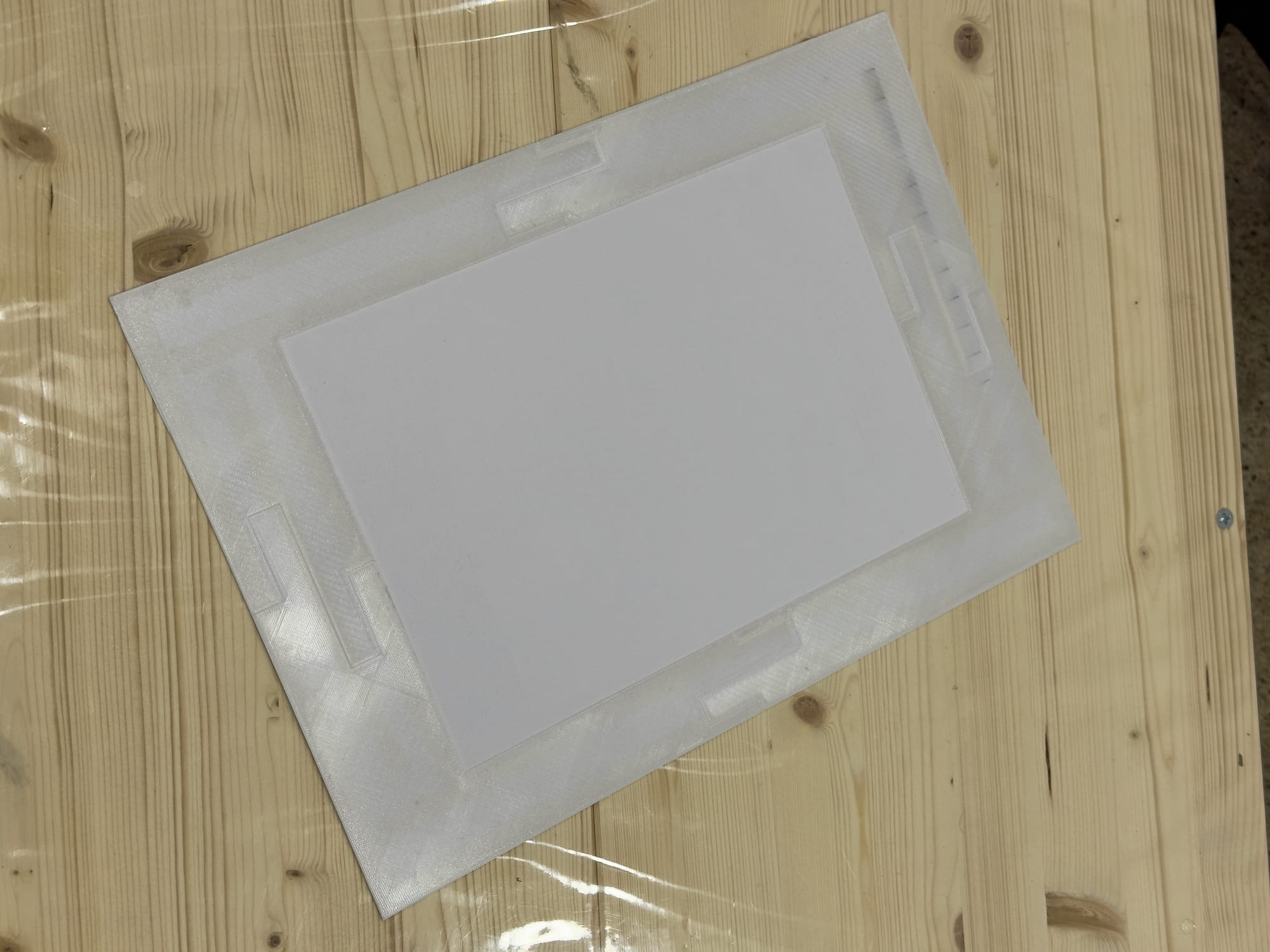
When it’s time to print, use a little low-tack masking tape to hold the photopolymer plate in place.
Establish initial printer settings
Firmware and printer settings
Make sure your P900 has the latest firmware installed; you can do this from the printer itself.
Then, on the printer, go to “Settings” > ”Printer Settings”, and set
- Error Notice > Paper Mismatch: Off
- Error Notice > Detect Paper Meandering: Off
- Thick Paper: Off
Now, these may sound counter-intuitive, but the reasoning is…not super clear to me either. I took these settings from Clay Harmon’s P900 set up guide, and I’m going to just take it as good advice. I believe disabling the Thick Paper setting in particular prevents the paper from overloading our custom media type (see below), but that’s just a guess. Maybe Clay Harmon can tell us?
Driver
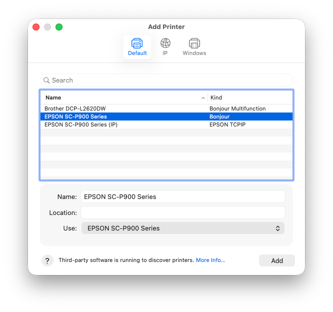
Download and install the official Epson driver. Don’t skip the utilities, because we need Epson Media Installer too. I know, no one ever actually does this, when Apple’s default printer utilities usually work just fine. But because we need very low-level access to the printer, we have to go through the official drivers. You might want to uninstall the Apple AirPrint driver to avoid confusion. Once you’ve installed the proper drivers, add the Epson printer over WiFi as a Bonjour printer (not as an EPSON TCPIP printer); apparently QTR doesn’t work over USB? Maybe?
Epson Media Installer
This is a great, but weird, piece of software that allows you to define custom media and send it to the printer. We need to add a custom media type that tells the printer about the physical characteristics of the plate carrier. And lucky you, I’ve already done this. Download this file first.
Then, in Epson Media Installer, click “import”:
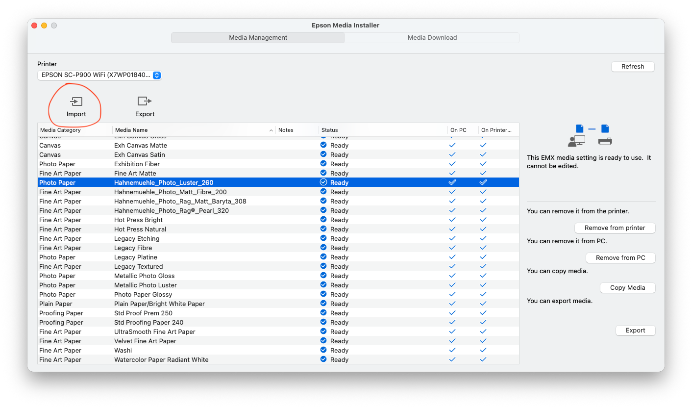
Then, find the new entry, it will be called “DTP Carrier Plate”. If your carrier plate is a different thickness, you can adjust that by clicking “edit”. Then click “Set to printer”:
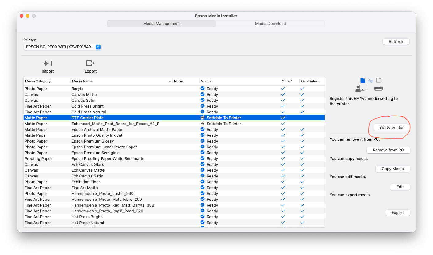
Whenever you prepare to insert the carrier into the printer, and this is really important, choose “poster board” as the media type. Then when it asks in more detail what kind of media you are using, select DTP Carrier Plate from the options.
Open Bite and Exposure Test
Now we need to establish two important parameters: Exposure time/amount, and ink loading. The exposure time is what it sounds like, how long we need to expose a plate to a UVA source to get a good etching. The ink loading is how much black ink can we use before we get an open bite on our plate? We can establish both of these parameters at the same time by creating a series of step-wedges, and exposing each row to increasing amounts of light. I’m using the sun, living as I do in sunny Lisbon, but this technique works just as well if you have a dedicated UV exposure box.
Generate the Open Bite Curve
Open QuadToneProfiler-DN, and choose “Starter Curve Setup”.
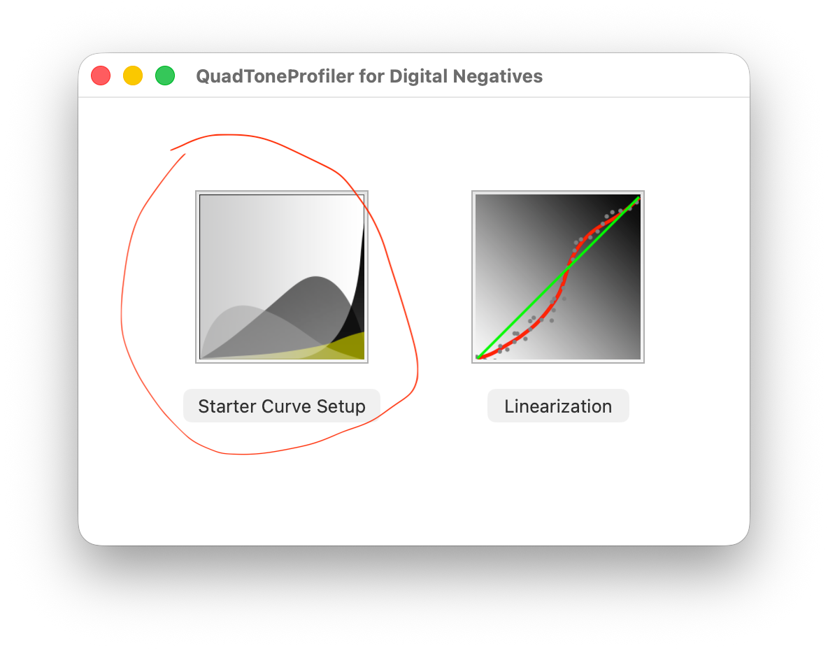
Make sure to select your printer model, and that the Process is set to “DTP Photogravure”. Check “Save DTP Open Bite Curve” and “Auto Install”. Then click “Save quad file”.
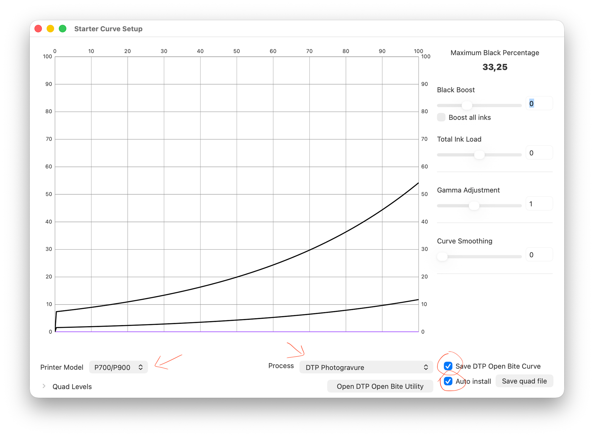
“Quad” files store the information that QuadToneRIP uses to map on-screen black values to particular blends of ink in the printer. The open bite curve lays down varying amounts of matte black ink, which is the most opaque to UV light, so we can find how much is too much.
The Auto Install option will create a new QuadToneRIP printer device called QuadP900-DN, and load this quad file as available to use with it.
Print the Test Image
Download this image, and load it into Print-Tool.
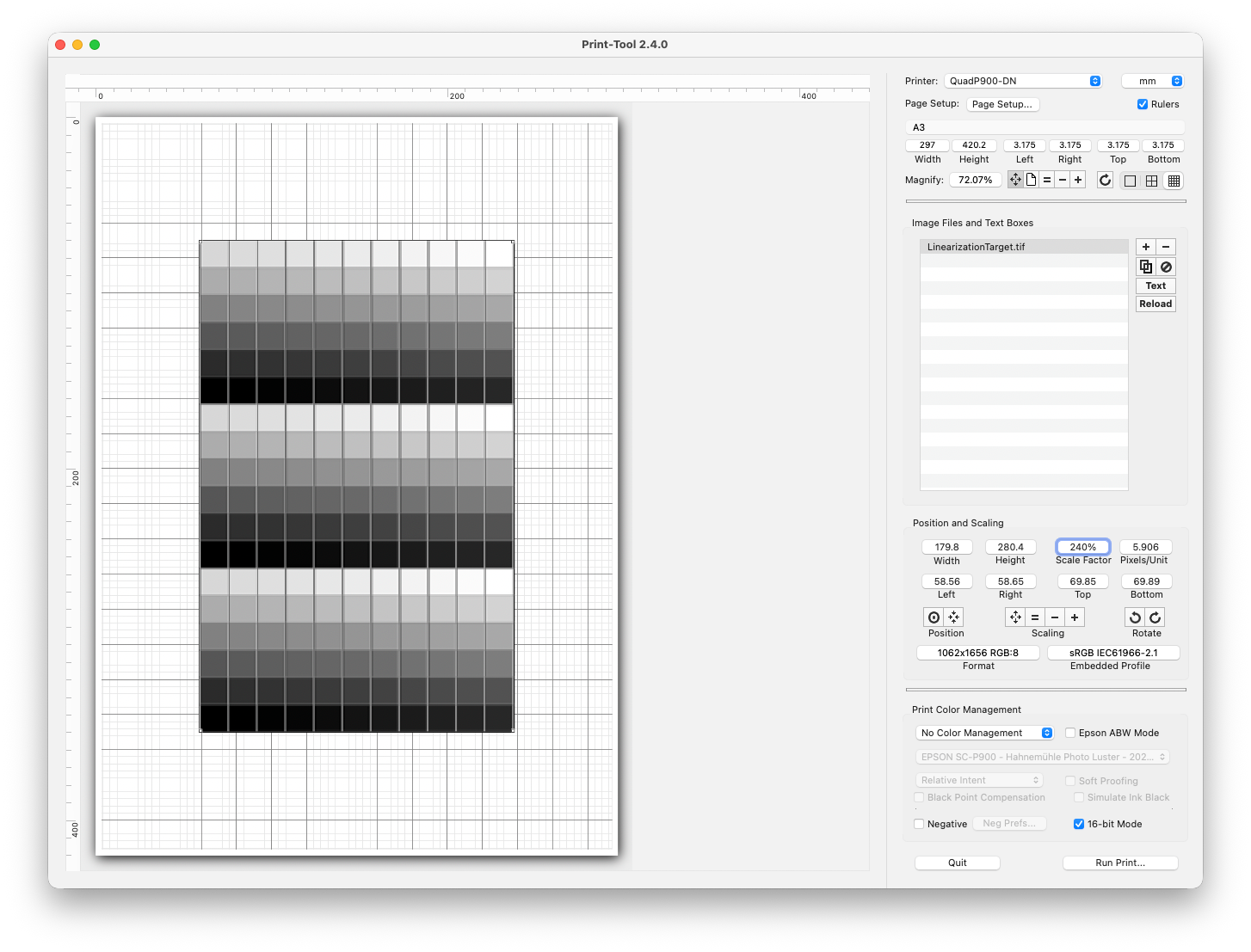
Make sure you have selected QuadP900-DN as your printer. Choose a paper size that matches your plate carrier, I’m using an A3 carrier. And because my plate is A4 in size, I’ve set the position and scaling of the image to match that, just a tad smaller to give some margins. You can use the bullseye Position button to center the image on the page, so it will print only on the plate itself.
Important, you must turn off all color management, and use 16-bit mode as well.
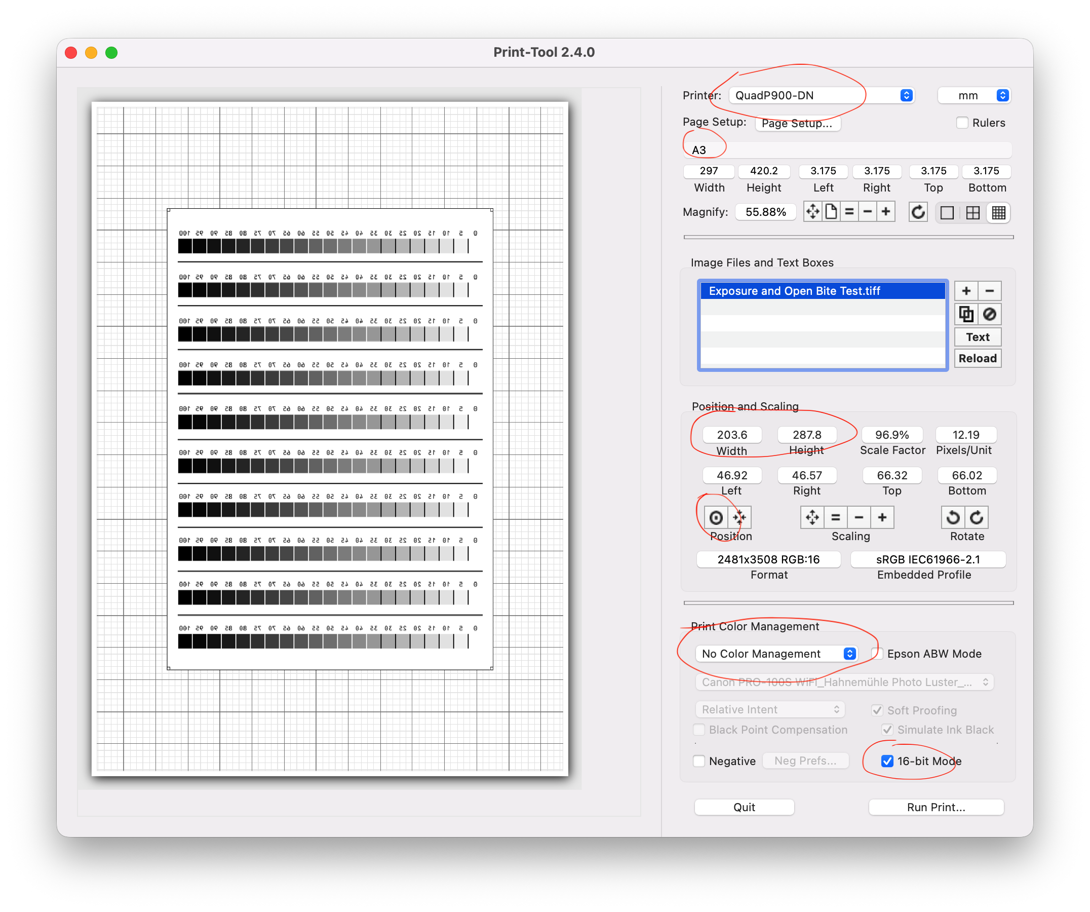
Then click “Run Print…”, and make sure again that the QuadP900-DN printer is selected. Then click on “Printer Options” then “QuadToneRIP”.
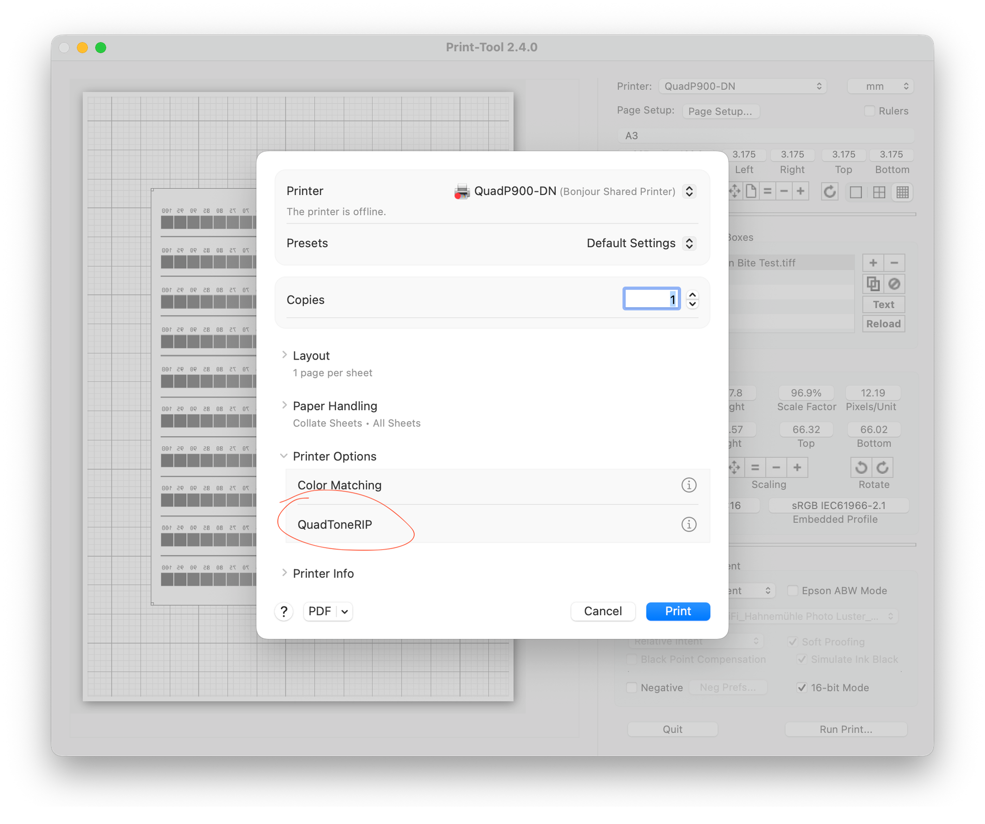
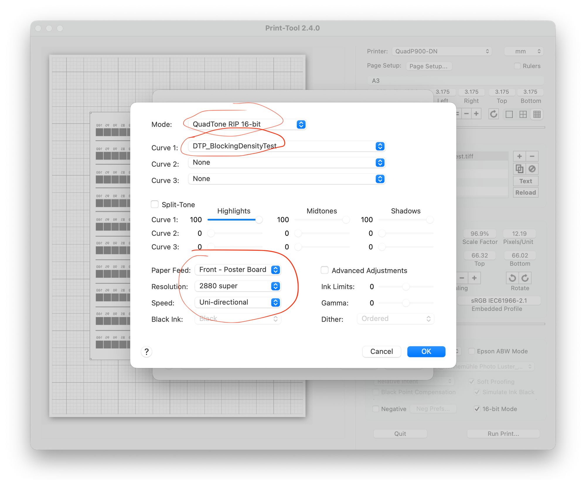
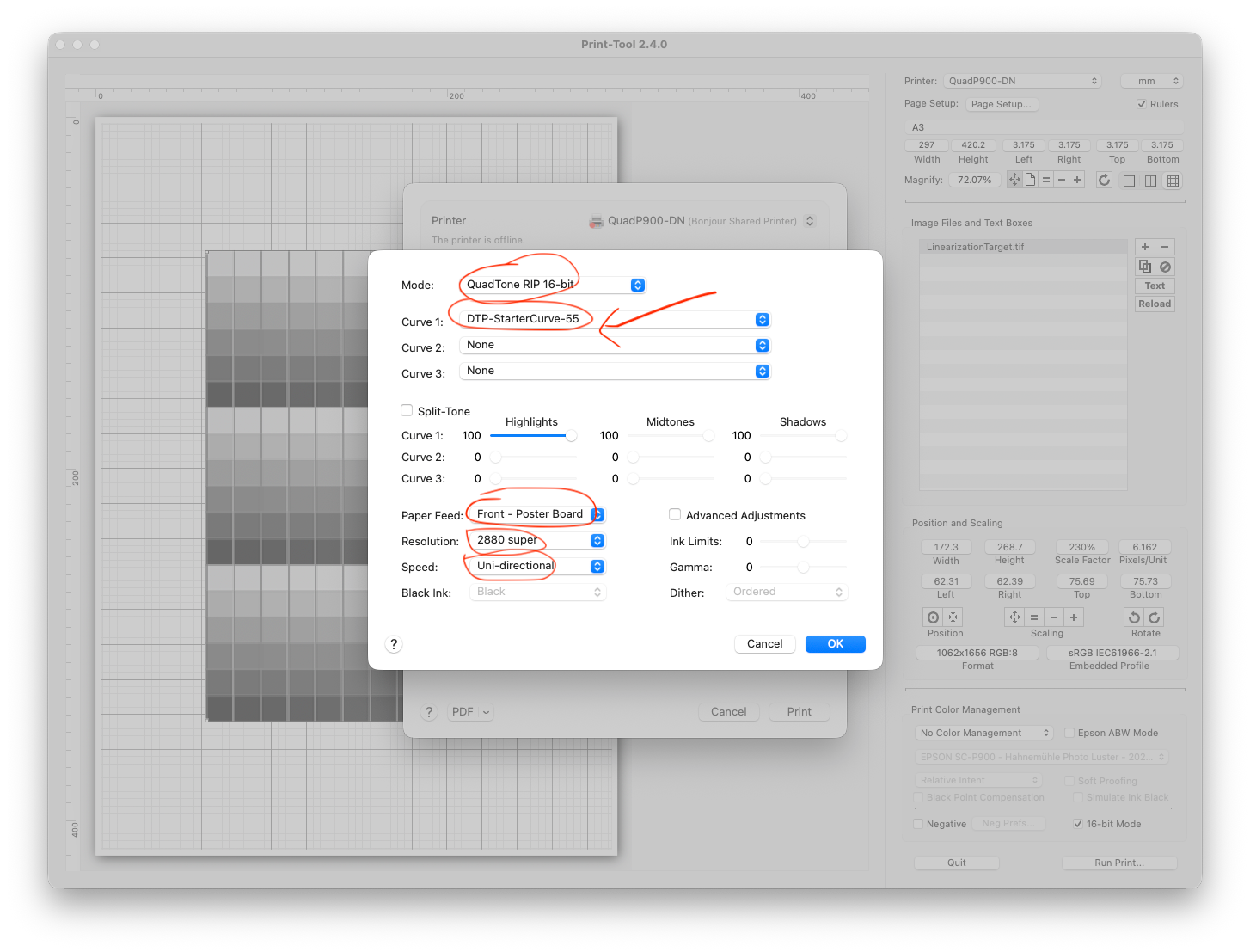
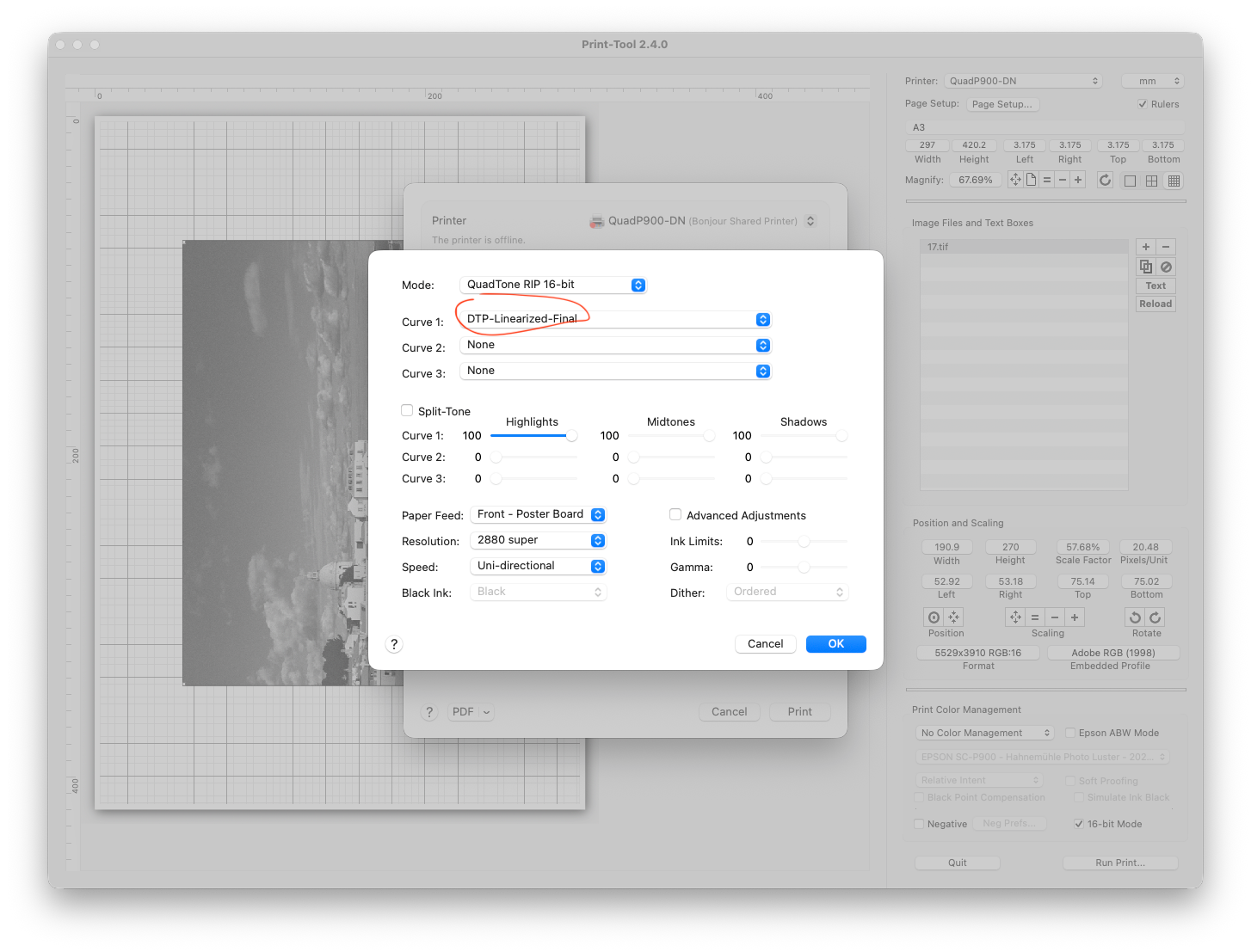
Now, make sure the mode is set to 16-bit. Then select the blocking density curve we created for “Curve 1”. Also, set the paper feed to “Front - Poster Board”, the resolution to “2880 super”, and the speed to “Uni-directional”. Selecting poster board will tell the printer we have thick material coming, and should disengage the ejection rollers that could damage our plate. The resolution is absolutely necessary, because otherwise we will see strong dithering in the resulting print. And the speed increases the accuracy of the print, and gives the ink space to dry between print lines.
Press “OK”, but don’t hit the Print button just yet!
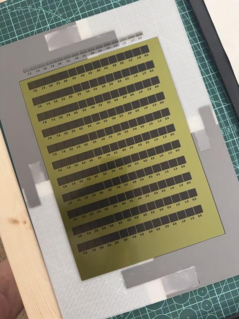
Load your plate into the carrier. You should tape the plate down from the back side using thin masking tape. Don’t forget to remove the protective sheet from the top! Then open the front tray in the printer, insert the carrier to the loading mark (photos coming soon), and choose the DTP Carrier Plate as the media option on the printer and tell it to load.
Then, hit the “Print” button.
You should get something like this, except hopefully the entire image is centered on the plate: I didn’t load the carrier properly, and got a misaligned print.
Expose and Etch the Test Image
Now, we need to expose each test strip for a decreasing amount of time. Pick a minimum time and an increment. I use a home-built UV dosimeter, but it’s not yet ready to share yet. I would suggest a range of 5 to 15 minutes. Go outside, covering the entire plate with thick posterboard, and point the plate into the sun the best you can. Uncover the first row and start your timer. Every minute, uncover the next row. By the time you uncover the last row, 10 minutes will have elapsed. This is where you then leave it for 5 more minutes, so the first row will will have gotten a total of 15 minutes, and the last row just 5. Then cover it back up and bring it in.
Bear in mind that the power of the sun varies by location, and by your ability to angle the plate to face the sun directly! Use an easel or similar to help get a good angle. You may have to run this test more than once to get good, meaningful results.
Of course, with a proper UV dosimeter, this all becomes considerably more precise, but that’s for another time.
Ink and Print the Test Image
Just like normal! Of course, this is probably the first time you’ve ever done this. There are plenty of tutorials elsewhere that show the technique, and you’ll develop your own as you evolve and grown in your practice. I like to use Charbonnel etching inks, wiped first with tarlatan then with tissue paper.
Then run it through your press. Again, I’m not the person to be telling you how to do this, but I do love my RL Vorster tabletop press.
Evaluate the Test Image
Here’s the fun part. If the range of times was right, you’ll see some rows with open bite in the dark parts, and some rows without. You want to pick a row that had a reasonable exposure time, and little to no open bite. In this case, I chose row five (labeled 2000, for 2000 mJ/cm², because I was measure UV dosage rather than time), as that row took about 10 minutes to expose in the sun, and although it did show some open bite, I really didn’t want to push the exposure much higher. The tradeoff to higher exposures is heavier ink coverage. More ink coverage means theoretically a smooth range of tones, but it also means money. So I wanted to balance the cost and the time.
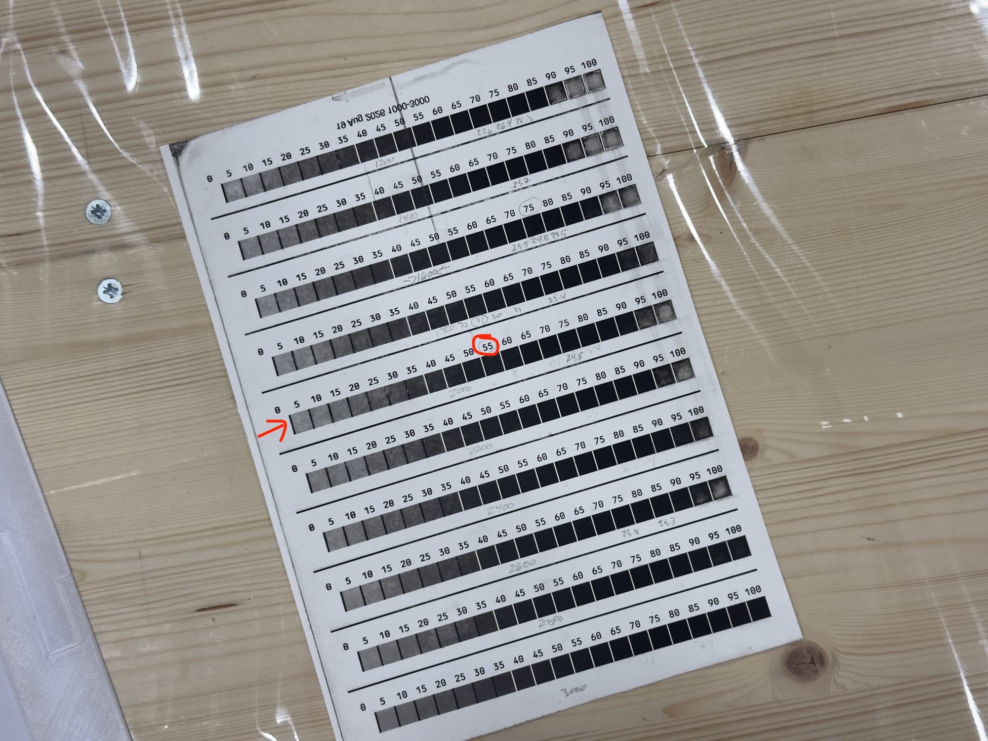
The next step is to find the square with the lowest number above it that is sufficiently black. In this case, I chose the square labeled 55. This is, as near as I can tell, a magic number. We’re going to use it in the next step, linearization.
Linearization Phase One
This is where things get really weird. The ink from the P900 blocks UV light, but it does so in a way that…surprise…we can’t see, and that doesn’t correspond neatly to the way it blocks visible light. So if we just print a black and white photo directly to a plate, it’s going to come out of the whole process with really strong contrast. We need to tame this contrast curve so that our midtones print correctly and the contrast looks good. This process is called linearization, because it creates a linear mapping between the tones we see on the screen and the tones in the final results.
So, off we go to QuadToneProfiler-DN again. Go back to the Starer Curve Setup window.
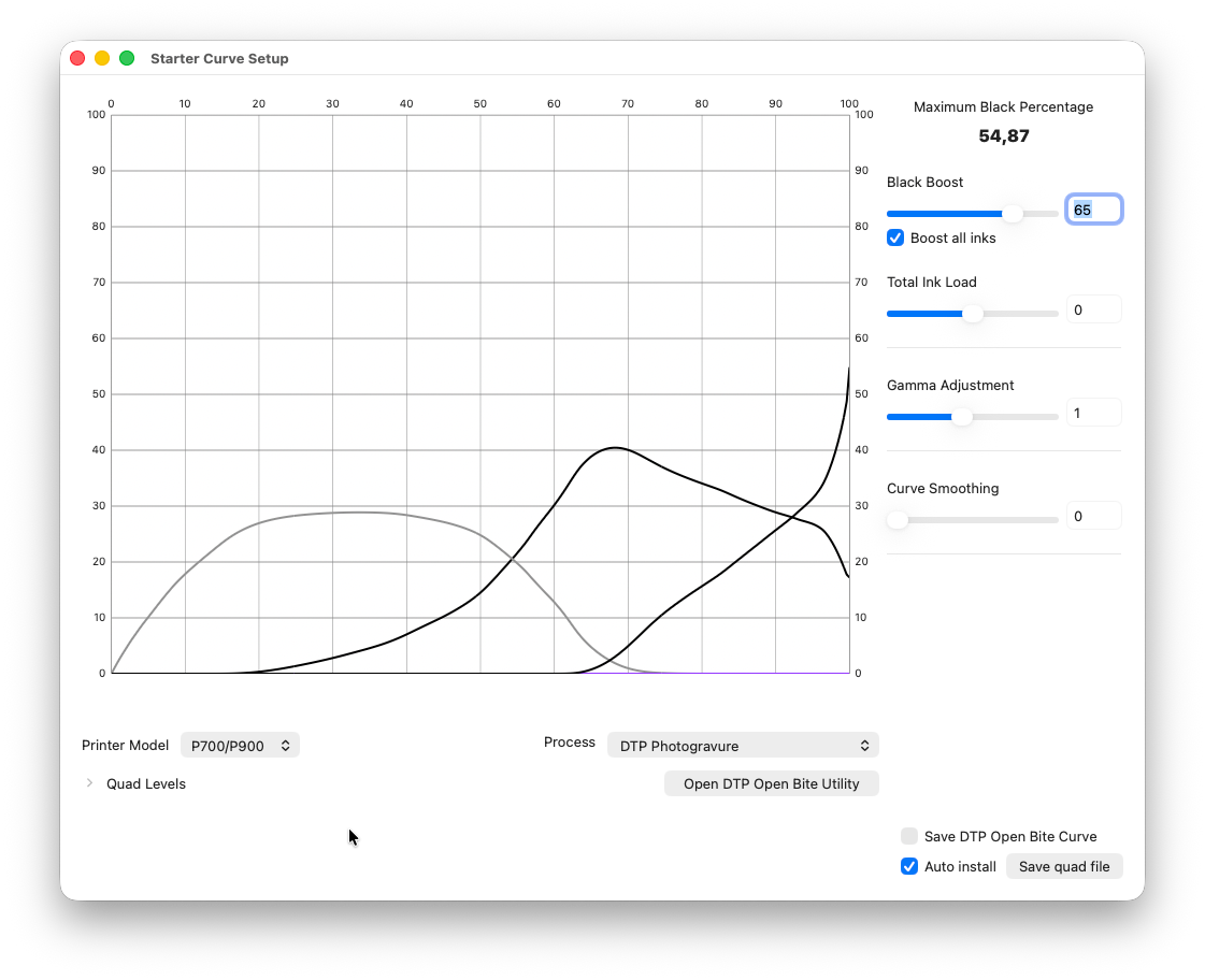
Skip the Open Bite Utility, we’re done with that. Make sure you have the right printer model selected, as well as “DTP Photogravure” for the process. Then take the Black Boost slider on the right, and scoot it over until the number under “Maximum Black Percentage” matches what we picked from the open bite test print, in my case 55. Also check “Boost all inks”, so the tonality is adjusted across the whole range, not just the black end of the spectrum. Tick “Auto install”, then click on “Save quad file”. You’ll be prompted for a filename, pick something memorable like, say “DTP-StarterCurve”.
Now, download these files. This archive contains an image file, which we’ll print below, and a “ti2” file which is a special file that ArgyllCMS can use to understand how the image file should print. (You can also use the TargetGenerator app is a free download, link up above, to generate your own targets if you don’t like mine.)
Just like before, size it a bit down from A4 in Print-Tool.
The hit “Run Print”. In the print dialog, make sure you’ve selected the correct QuadToneRIP printer (in my case called “QuadP900-DN”—not “QuadP900”). As before, set up 16-bit printing, the proper paper feed, resolution, and speed. And select your new starter curve as Curve 1.
The print the plate. Exposure it at the time or dosage you determined in the previous step, and print it out. Let it dry for a few hours.
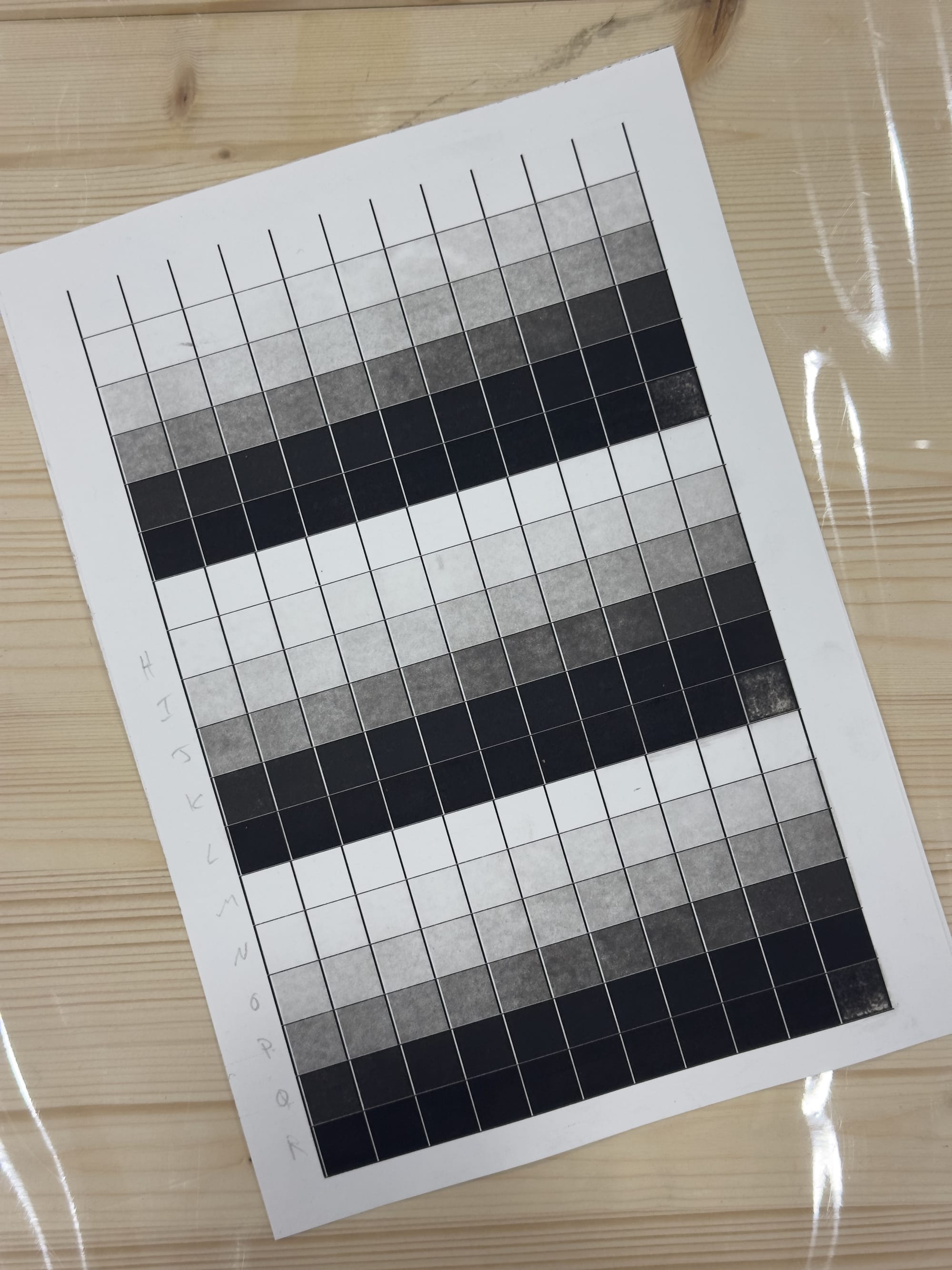
You will immediately see that the contrast is way off. You will also notice that despite my best efforts I ended up with an open bite in the darkest square, something I had to manually compensate for later. But ideally that doesn’t happen to you. Anyway, let’s scan this in!
Calibration Scan
This is where we need something like the Calibrite ColorChecker Studio, or another device for calibrating printers. And where we need to dive into the arcane world of Terminal.app. I apologize in advance. You’re going to hate it.
So, first of all, put the files LinearizationTarget.tif and LinearizationTarget.ti2 into a folder you can find easily. Then open the Terminal app—it’s in the Applications folder, under Utilities. This is a text interface to your computer. Begin by typing cd (include that space at the end!), and then drag the folder you kept the files in into the Terminal window.
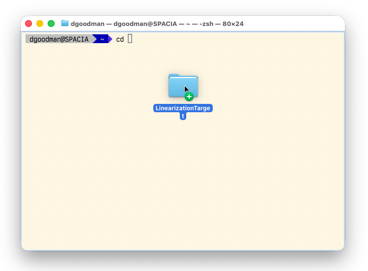
Then press return.
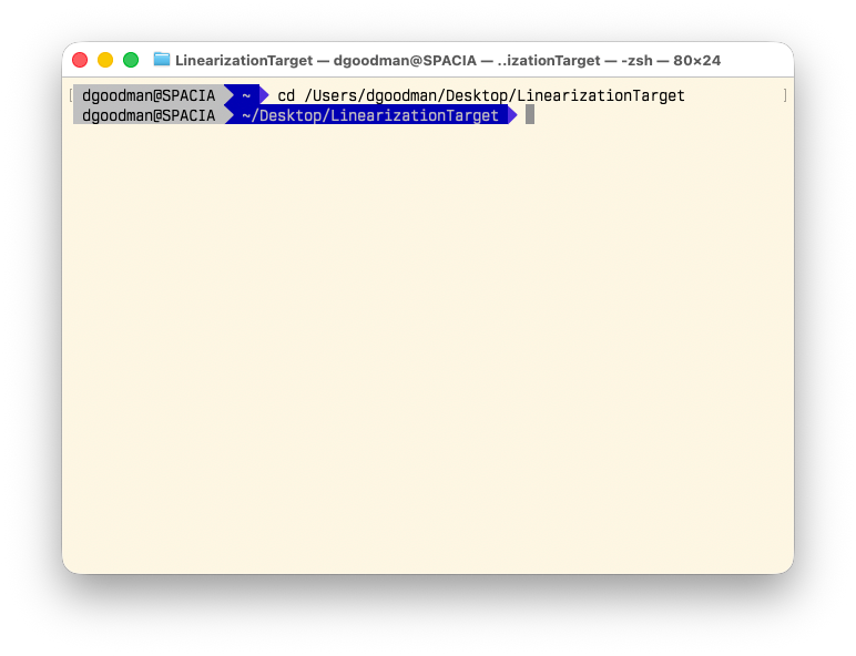
Now, plug your printer calibration device into your computer, and type chartread -v -n -l -S -p LinearizationTarget. This will load ArgyllCMS, and tell it to look at the “ti2” file. It will ask you first to calibrate your device, and then prompt you to scan each and every square in order, from left to right, top to bottom. It might help to label each row as “A”, “B”, “C”, etc., with a pencil first. This will take a long time.
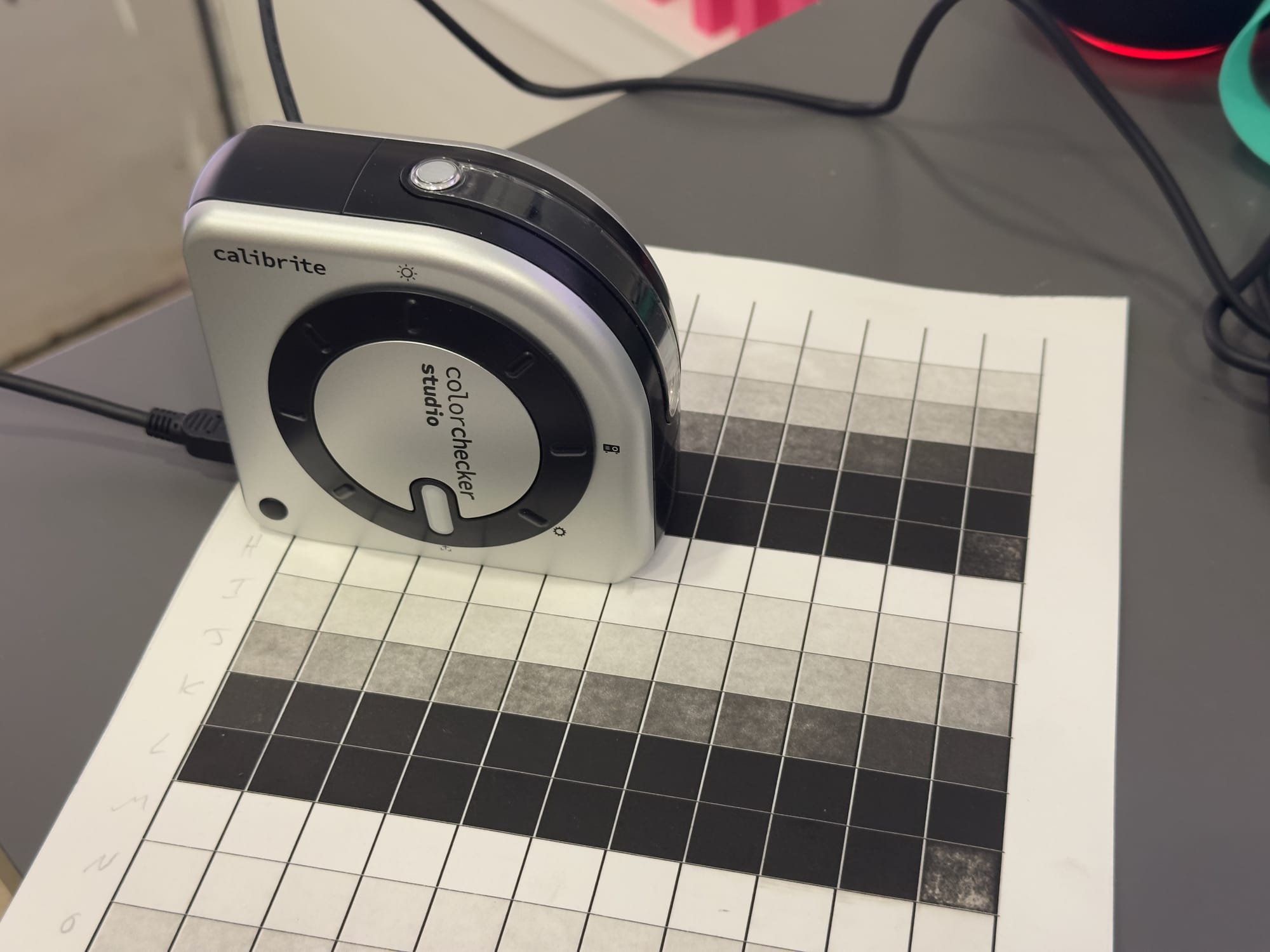
Normally, chartread can scan rows continuously, but the tonal values we’re scanning are so far off from the idealized version encoded in the “ti2” file that it will throw errors left and right, so I find doing it a square at a time is better.
The reason I included three copies of the target is to compensate for uneven inking, wiping, and printing technique. chartread will take an average from all three charts.
Finally, when it’s done, hit d to tell it you’re done. chartread will produce a file called LinearizationTarget.ti3 in that same folder.
Generate the Linearized Curve
Now, open up QuadToneProfiler-DN again, but this time choose “Linearization”.
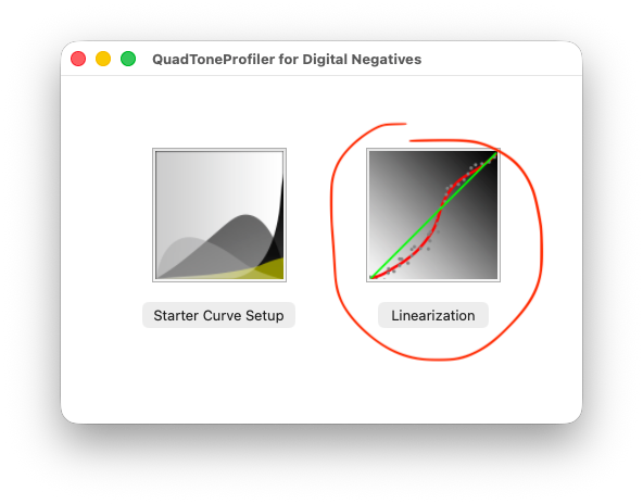
Then click “Open Measurements File” and choose LinearizationTarget.ti3, the output from chartread. The click “Open Quad File” and choose the starter curve quad file you generated way back earlier.
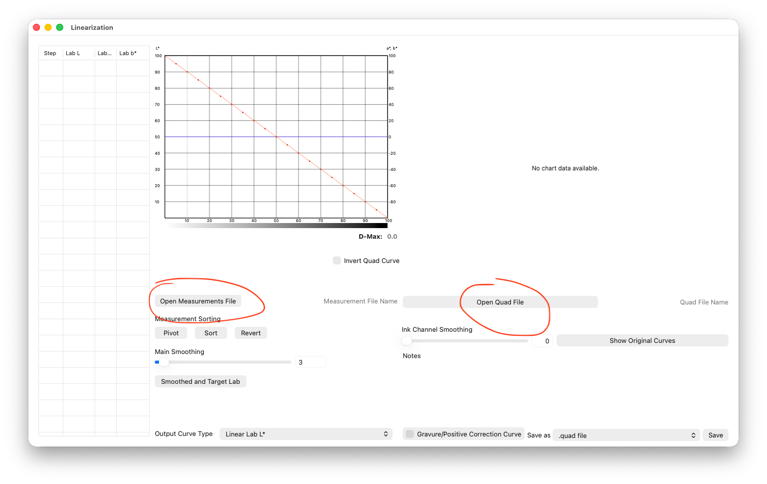
Once you’ve opened the measurements file and quad file, you’ll see something like this. Then, after you’ve opened the files, be to tick “Gravure/Positive Correction Curve”.
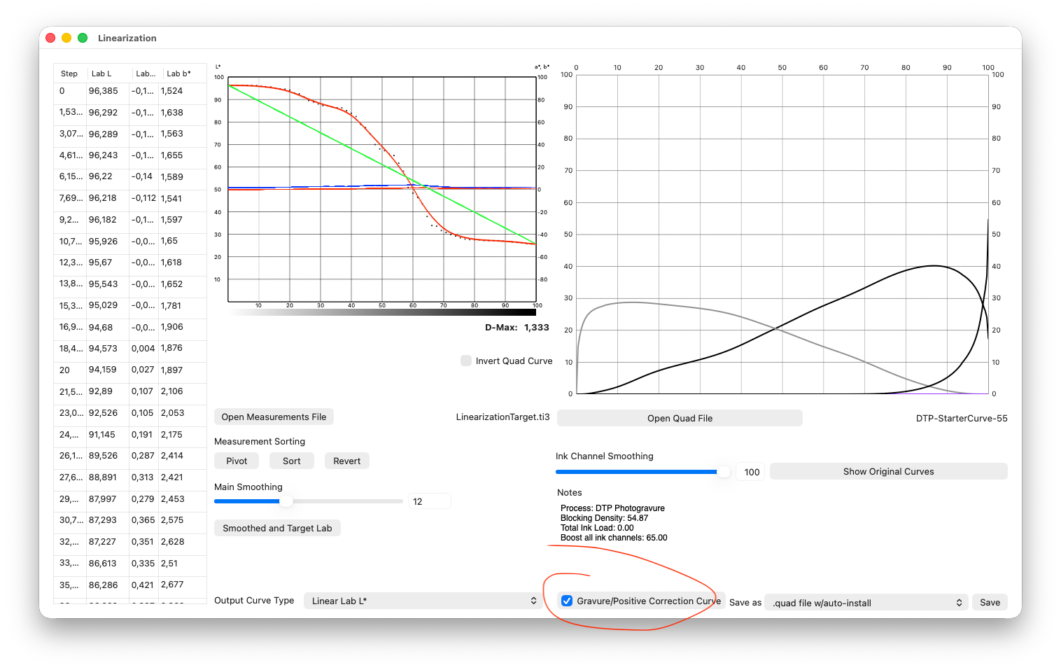
The left chart plots measured tones (y-axis) against ideal tones (x-axis). The dots are the measured data points from chartread. The straight green line is the ideal plot. The jagged ugly red line is fitted to the raw data points. It’s just like the curves adjustment tool in Photoshop or other photo editors (except black is on the right, where normally we see it on the left). In my case, you can see the extreme contrast curve revealed by my test print. What this tool does is generate a new quad file that compensates for that curve, and attempts to straighten it out. On the right, you can see the proposed ink usage curve—in my case, it starts out with pretty heavy use of Light Gray for the highlights, begins mixing in Photo Black with the middle tones, and finishes with a flourish of Matte Black to get us to rich dark tones. You can click “Show Original Curves” to see a comparison with how inks were used before.
Anyway, mess with the “Main Smoothing” slider to even out the red line a bit, reduce the noise a little while staying true to the general shape of the data points. Then tick “Save as .quad file with auto-install”, and hit save. Give it a useful name, like “DTP-Linearized-V1.quad” (V1, because, you guessed it…we’re going to do this again!).
Linearization Phase Two
Now, we do it all again. Our new quad file is pretty close to ideal, but we need to verify. Repeat all the steps as above, but this time when you go to print the test target, choose the new linearized quad file, instead of the starter curve.
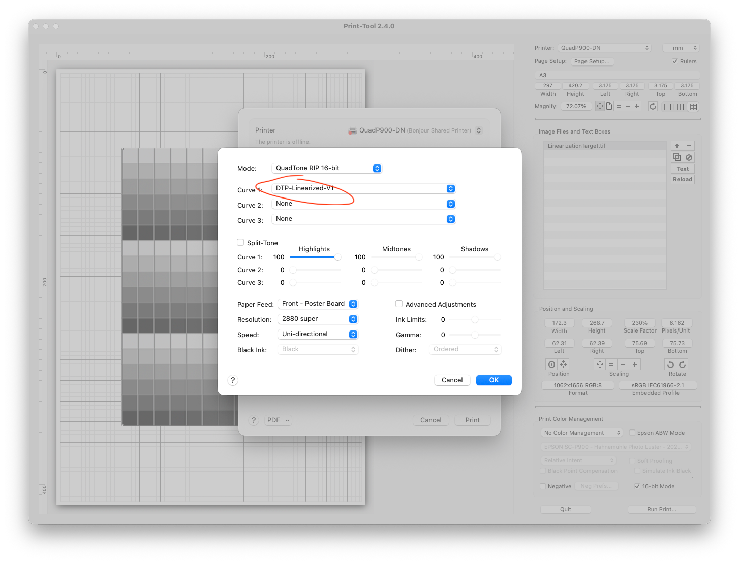
Print a fresh plate, expose, develop, ink, wipe, print. This time, though, you should see a thing of beauty.
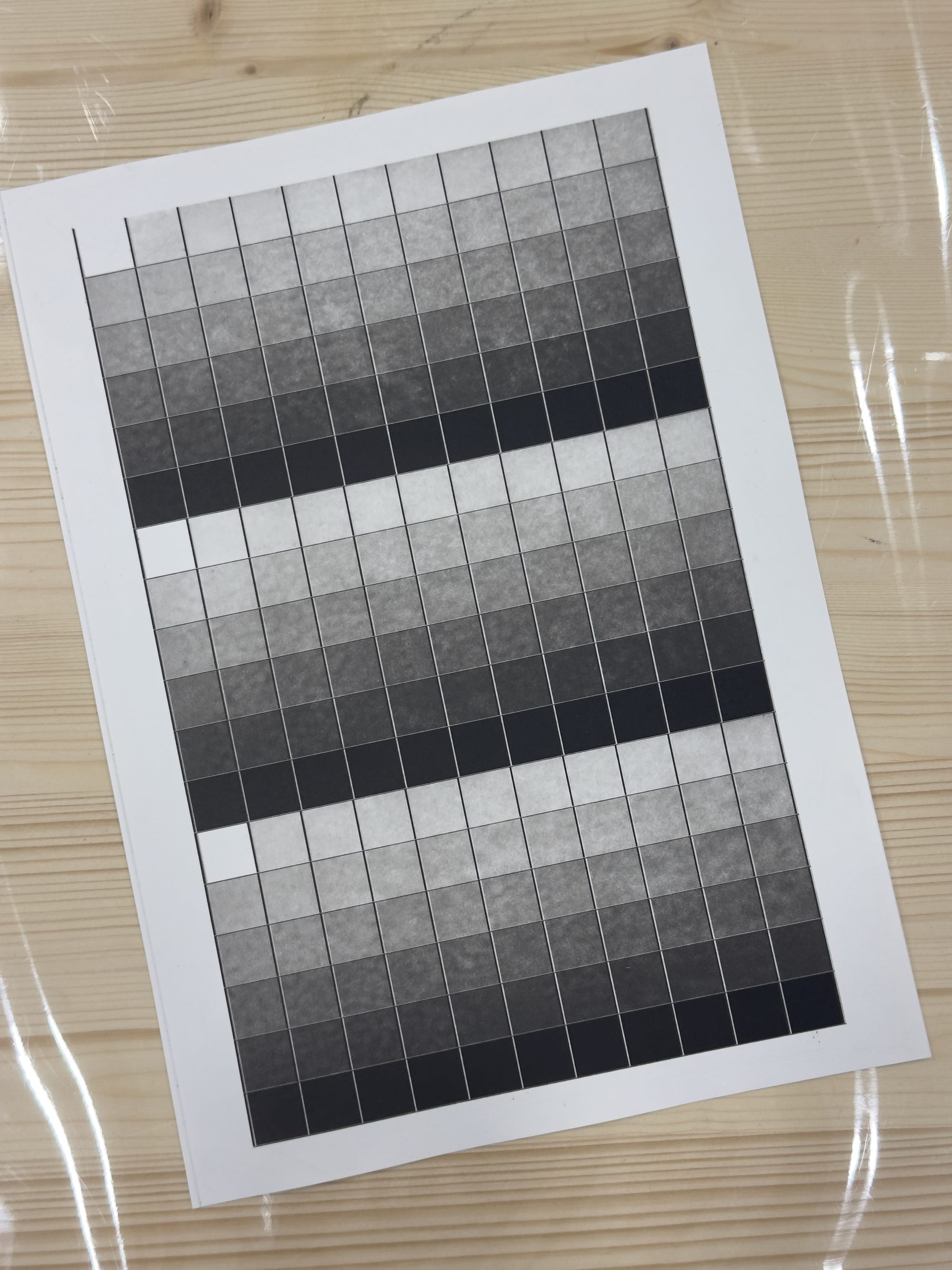
Look at that smooth, even transition from white to black! There are a couple of issues here, and this is why we do this in two passes. The issue a second pass fixes is that there is too steep a jump from pure white to the lightest shade of gray. The second issue is that—and I’ve seen this consistently across all of my prints—is the mottled texture. This is very clearly an issue with the DTP process, I can see the mottling pattern in the fresh ink from the P900 on the plate. I don’t yet know how to deal with this, so for the moment we are going to set the issue aside and press forward because it doesn’t really affect the calibration process.
Calibration Scan, Again
Repeat the scanning process in Terminal with chartread only this time with the new print.
Generate the Linearized Curve, Again
And, repeat the process with QuadToneProfiler-DN, only this time you should seem something a lot…less curvy. But still not perfect.
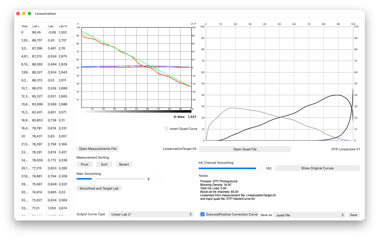
The red line on the left clearly shows the discontinuity between pure white and the first gray. There are also some other subtle discontinuities. But we’re really close! Again, adjust the “Main Smoothing” slider until you get a red line that follows the data points, but isn’t needlessly jagged. Then save and install the resulting quad file.
Now, if you’re masochistic, you could repeat the linearization process a third time. It can only get better! But for me, I think this is good enough.
So, with that, you are done! Congratulations! Go make some awesome photogravure prints!
When printing a new plate from Print-Tool, make sure you’re using the QuadToneRIP printer, and you select the final quad file as your Curve 1.
Tips and Tricks
Gouges
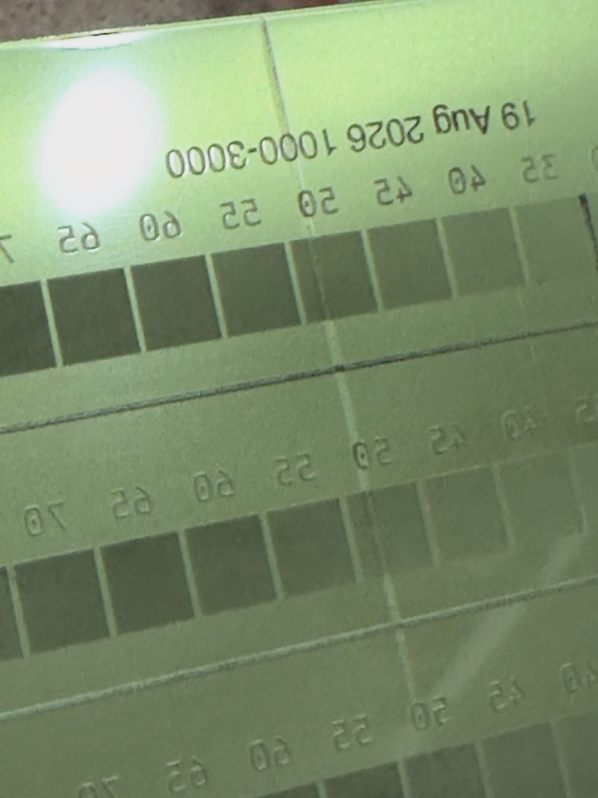
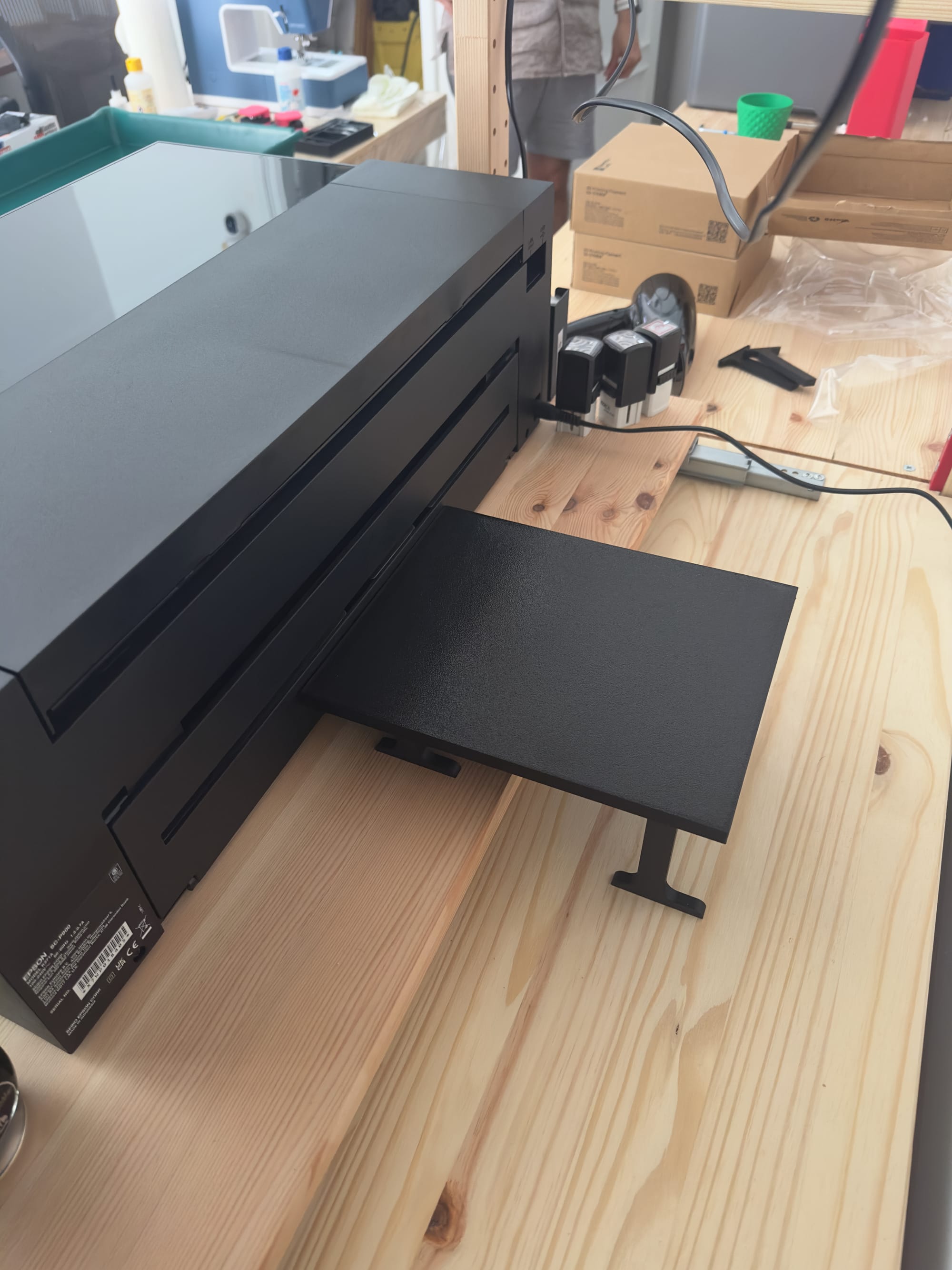
I saw these in almost all of my plates. The leading edge of the plate would have a long gouge down the middle. I’m pretty sure this is because when the P900 pulls the plate through the back, the weight of it makes it droop, and press the leading edge of the plate against something inside the printer. I made a little support that I stick behind the printer to keep the plate from dropping—you could just use a stack of books, honestly—and once I started using this, the gouges went away entirely.
Useful resources
These are the resources I’ve drawn upon to make this document. You will find contradictions and incomplete information; I am really hoping the resource you just read above fills those gaps and gives a complete picture.
Online
- Clay Harmon’s blog: clayharmonblog.com
- P900 setup guide
- Original DTP Quick Start. An older process, but still worth reading to get some clarity.
- In the Weeds with DTP. Background on earlier ink-blend experiments, obsolete but interesting
- Downloads. Lots of good stuff, dig around in here.
- Walker Blackwell's description of his DTP setup sequence: photrio.com/forum/threads/direct-to-plate-polymer-photogravure-any-step-by-step-guides.216424. Includes descriptions of his exposure test, open-bite/limiter test, calibration to contrast intent, validation; also describes multi-row averaging targets. Note his ink-channel description reflects his own studio setup, not the QTP-DN curves.
- QTP-DN V3 support site: publish.obsidian.md/quadtoneprofiler
- QTP-DN V3: developingbyinspection.com/quadtoneprofilerdn
- QTP-DN V3 additional resources: go to publish.obsidian.md/quadtoneprofiler, navigate to the QTP-DN V3 documentation, and find the resources download link for
QuadToneProfiler-QuickCurve-DN-Resources.zip - ArgyllCMS chartread workflow: bwmastery.com/blog/2021/using-argyll-cms-to-measure-grayscale-step-wedge-targets
Books
- Printmaking: A Step-by-Step Studio Guide by Jenny Mason-Gunning
- Polymer Photogravure by Clay Harmon
Photogravure: Instruction Manual by Henrik Bøegh