If you’ve never made prints from your images before, you might be surprised when your prints come back and the colors or the quality are disappointing. Preparing an image for printing requires some careful consideration and a modest knowledge of the process to get the best results. It’s not difficult, but it’s also not obvious. Hopefully these guides will help prepare you for your next print run, so your prints are precisely how you expect them.
There are several considerations that are important for the printing workflow that you normally don’t have to think about when posting to social media.
- Image Resolution
- File format / Compression
- Color Depth
- Color Space
Image Resolution & Print Density
With digital images, we are accustomed to thinking of their size purely in terms of their resolution. A 40MP image is larger than a 26MP image, because it has 46% more pixels. Size is a purely logical constraint, not a physical one.
But in print, image resolution is only one part of the equation. The other part is print density, measured in DPI or DPCM: Dots per inch/centimeter. This is because unlike a digital screen, the dimensions of the paper are a physical constraint: The same image will print at a finer resolution on smaller paper and a coarser resolution on larger paper, with no change to the image itself.
What is the right density to print at? In general, the rule of thumb for a fine-art print is to aim for 300 DPI or 118 DPCM. At this resolution, the eye cannot see the individual dots or pixels that make up the print, and the image is smooth and continuous. Practically speaking, this means having a file with the minimum pixel dimensions (assuming portrait orientation):
| Paper Size | Minimum Width | Minimum Height | Resolution |
|---|---|---|---|
| A5 | 2480px | 1748px | ~4MP |
| A4 | 3507px | 2480px | ~9MP |
| A3 | 4960px | 3507px | ~17MP |
| A2 | 7015px | 4960px | ~35MP |
How to verify
Most image processing software can calulate the largest print you can make at a given DPI / DPCM. Unfortunately, the process for doing this varies quite a lot from program to program, so I can’t give concrete advice here. But knowing the resolution of your image, and the table above will get you to close.
The role of viewing distance
The demand for 300DPI is not a law of nature, however, but just a rough guideline. This is because while a physical print has absolute dimensions, the viewing distance is a factor as well: The apparent size of a print gets smaller as you step back. The 300DPI guideline are based on the assumption that you will be viewing the photo at about arm’s length. In many cases, however, the viewing distance might be much more. This is especially true with larger prints, where being able to take in the entire photo requires you to stand further back. So, in fact, at A2 I have personally gotten excellent results with 26MP images that print at about 250 DPI / 100 DPCM, and in many cases you can dip much lower.
To give an extreme example, roadside billboards (which are massive) are often print at 20-50 DPI or 8-20 DPCM, roughly the equivalent of a 2MP image. This works well because the viewing distance is tens of meters or more. At that distance, you cannot resolve the individual dots, despite the very low print density and image resolution..
So, when deciding if your files have sufficient resolution to print at a particular size, consider the expected viewing distance. 200 DPI / 78 DPCM is plenty for a viewing distance of 1 meter or more, and 150 DPI / 60 DPCM is sufficient when the viewing distance is 2 or more meters.
What if my files are too small?
Even after considering the viewing distance, if your file’s resolution is too low, the only real options are either accepting the loss of quality, or making a smaller print. You might be tempted by AI upscaling programs that use AI to make images bigger. But even the best of these programs introduce image artifacts, especially in faces, that tend to look uncanny or even garish.
That said, nearly all quality digital cameras produced in the last 15 years can produce images with sufficient resolution for printing to A3 or A2, even cropped. Problems with resolution only really pop up with extreme cropping, which simply highlights the importance of having the right lens for the kind of photography you want to make.
What if my files are larger?
There is never any problem with printing images with resolutions greater than the recommendations. At Katsudon Experimental Press, our printers are capable of printing at resolutions in excess of 1440 DPI / 567 DPCM, and with better quality paper even twice that. The fact of the matter, however, is that extra resolution will never be seen by a human eye. Nevertheless, our printing process matches the image resolution to the printer to obtain the best possible results.
File Format / Compression
There are a bewildering array of file formats out there, and it can be difficult to know what the best option is for delivering images to print. Not all file formats are well suited to printmaking!
RAW
When you photograph in RAW mode, this is what the camera delivers. RAW files are not technically an image. Well, they are. But they also aren’t. They are the raw electrical data delivered by the image sensor in the camera, and contain an amount of data far beyond what can be reproduced on a screen or in a print. They also, for reasons beyond the scope of this post, encode color information in a way that requires additional interpretation (called de-mosaicing) to render to a screen or a printer.
The purpose of a RAW file is to provide the maximum flexibility, latitude, and space for creativity in the image editing process.
RAW files cannot be printed. They must be processed, edited, and exported to another format that is suited for printing.
JPEG
JPEG files are rendered from RAW files, either in your camera or by your image processing software. The advantage to JPEGs are that they are easy to generate (automatically if you shoot in JPEG mode), are perfectly suited to sharing on social media, and are very small in terms of how much disk space they take up.
JPEG files are designed to keep file sizes very small, and they do this by discarding color information that you can’t easily see on a screen, and by discarding some of the spatial information, that is, by using mathematical operations to represent the texture and tonality you see, operations that are much smaller than the original image. As a result, the overall image quality of a JPEG image is often suboptimal, especially if you choose a high level of compression.
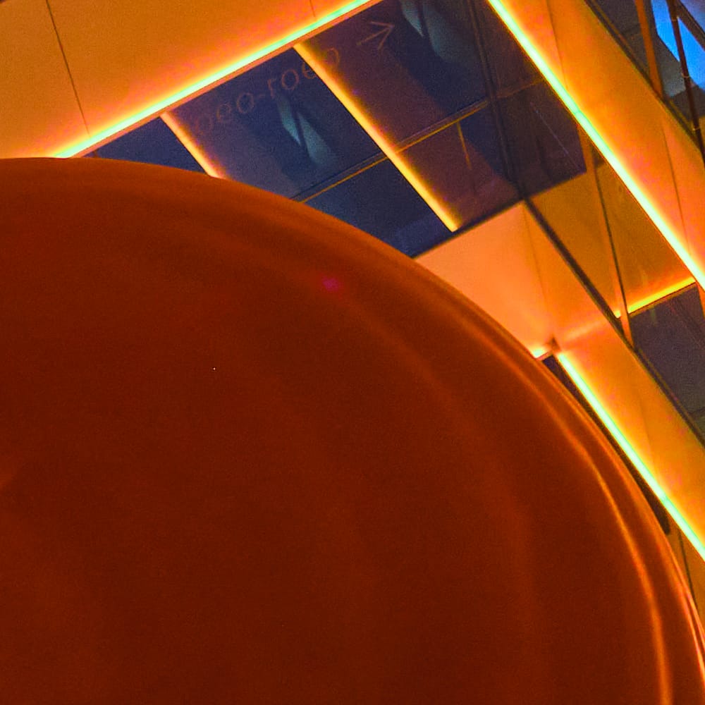
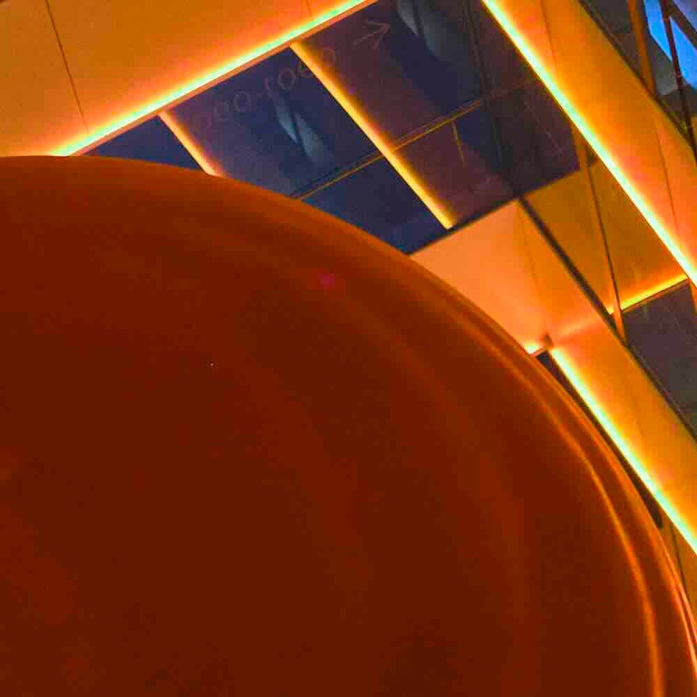
A comparison of how JPEG compression impacts image quality and color. Left: High-quality JPEG. Right: Low-quality JPEG
That said, JPEG images can be printable. The images must be examined on a case-by-case basis, but at Katsudon Experimental Press have nevertheless been able to achieve very good results.
TIFF
TIFF images are the gold standard for printing. Unlike JPEGs, they do not discard any color or spatial information during compression, and are capable of representing far more colors than a JPEG. The downside is that they are larger, and require a little more knowledge to produce appropriate files.
Other formats
Your editing software will undoubtedly offer other formts, including GIF, PNG, Adobe Photoshop, and more. In general, these are to be avoided: Each of these formats serves a specific purpose and so has its place, but printing is not one of them.
Practical Advice
When In Doubt, Shoot in RAW
Shooting RAW images gives you the greatest latitude for editing your image, often allowing you to recover crushed shadows and blown highlights, without discarding any information from your sensor.
Export to TIFF
I’ll have more practical guidance on this below, but you should always aim to export your edited RAW image as a TIFF (ideally with 16-bit color depth and the Adobe RGB color space, but again, more details on what that means below).
But I Shoot JPEG!
Some of us (and I’m looking at you, fellow Fujifilm lovers) like the straight-out-of-camera (SooC) look our cameras produce. The colors and tonality are often so good we don’t feel the need to do any editing. The downside to this approach is the file is in JPEG format. While many JPEGs will print just fine, you need to consider the downsides to JPEG files. In addition to the loss of information discussed above, JPEG files have almost no latitude for editing, and every time you save an edit, even if you are just cropping, you lose even more information from the image.
So if you shoot JPEG, aim to get the image right in camera, do not assume you can fix issues with editing.
Color Depth
Each of the file formats above represent color in one of a handful of different ways, some better suited to different purposes. The first variable is the amount of color information stored for each pixel, called the color depth. The second is how that color information is to be interpreted, called the color space.
Image files represent each pixel as three numbers, one each for its red, green, and blue components. 8-bit numbers, which can represent values from 0 to 255. This means that for each of the red, green, and blue channels, the file can represent 256 different intensities. Or they can be 16-bit numbers, which can represent values from 0 to 65535.
Files with a 16-bit depth can therefore represent far more shades of color than an 8-bit image can. When we multiply out the possibilities for each channel, this becomes clear.
| Bit-depth | Max value per channel | Total representable colors |
|---|---|---|
| 8-bit | 256 | ~16.8 million colors |
| 16-bit | 65535 | ~281 trillion colors |
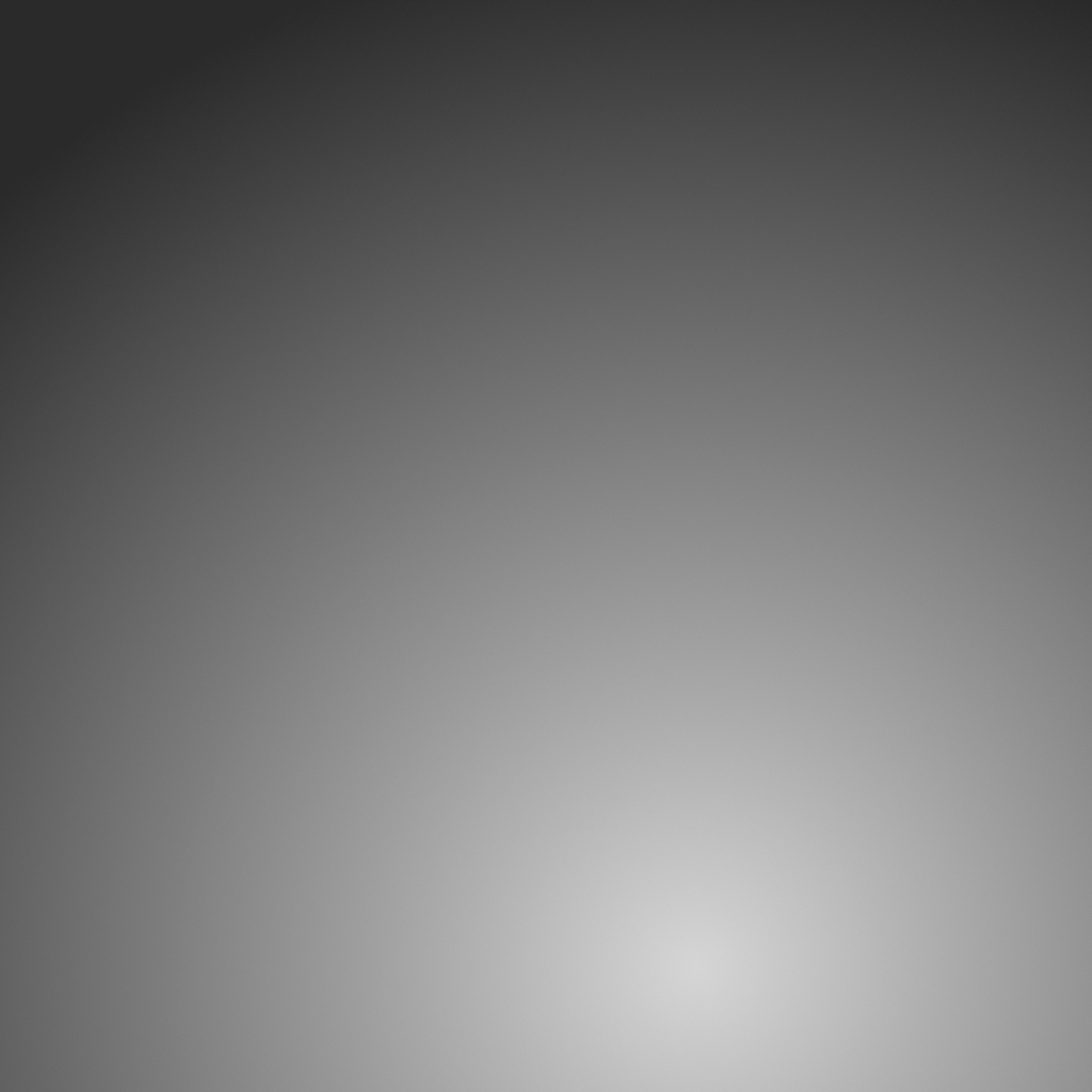
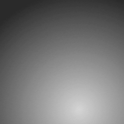
An exaggerated example of the impact of color depth. Left: smooth gradient in 16-bit color. Right: Degraded gradient in 8-bit color.
In short, the color depth determines the total number of shades available to each pixel, between absolute black and absolute white. 16-bit images display smoother gradients and more subtle texture than 8-bit files can. The tradeoff is that they are larger, of course!
Color Space
Where the color depth determines the number of colors that can be represented, the color space tells the computer how to represent them. Some color spaces are better suited to different tasks, naturally, and the right color space comes down to what is called its gamut. The gamut is the overal range of colors that can be represented in a file, displayed on a screen, or printed on a printer, a point we’ll return to shortly.
The most common color spaces you will encounter are sRGB, Adobe RGB, and ProPhoto RGB.
sRGB
sRGB is a color space used by most computer displays. An image in the sRGB color space will display just fine on your monitor or phone, but it is not the most versatile color space for printing. This is because the available color gamut is relatively small: It cannot represent all the colors that the human eye can see, nor all the colors that a good fine-art printer can print. So exporting an image as sRGB often (though not always!) means you will lose color fidelity.
Adobe RGB
Adobe RGB is an evolution of sRGB that expands the gamut to more closely match what our eyes can see (and what fine-art printers can print). It captures a wider range of more vibrant colors that will invariably produce a better final print.
ProPhoto RGB
ProPhoto RGB expands the gamut even further, well beyond what the human eye can perceive. This color space can represent "imaginary colors" that do not exist in the real world. This makes ProPhoto RGB an outstanding choice for editing a file, because is offers unprecidented levels of editing lattitude. As you shift the brightness and saturation of your image, your editor will draw upon this extra headroom so that you can pull out colors and texture that were otherwise invisible. But while ProPhoto RGB excels for editing, it is not suitable for printing because its color gamut is much larger than any printer’s. You will lose color detail and vibrancy.
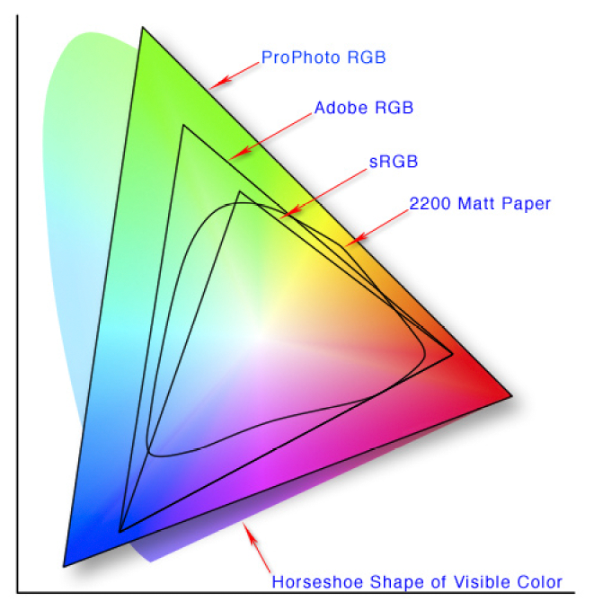
Here is a visual representation of the impact of different color spaces and their gamuts. The horseshoe shape represents all the colors humans can see. (Please ignore the fact that the monitor you are viewing this on cannot possibly represent all these colors, this is just an illustration!) The large ProPhoto RGB triangle shows how although this color space cannot represent all the colors we can see, it comes close. It also has colors outside the horseshoe, these are the imaginary colors in its space. Then we have Adobe RGB, which while still large cannot represent everything we can see. sRGB, what your monitor uses, is even smaller.
More interesting is the irregular shape shows what an Epson consumer printer is capable of representing. Notice that it expands beyond the sRGB triangle, and is just a bit smaller than the Adobe RGB triangle. And with the fine art giclée printers we use at Katsudon Experimental Press, the gamut is even larger! This is why you should deliver prints in Adobe RGB, as images in sRGB just won’t be able to take full advantage of all the colors a good fine-art printer can reproduce.
Final Advice
Put simply: Edit with a RAW file (which has no intrinsic color space), and export your resulting edits as a 16-bit TIFF in the Adobe RGB color space. This will result in optimal prints.
If you choose to shoot JPEGs, avoid editing the file in any way, choosing instead to get the settings and composition correct in camera. The results will still be very printable! Light editing and cropping and less ideal, but can still work.
This is a lot of advice in a small space, and we understand this can be deeply confusing. When you engage with Katsudon Experimental Press, we take image and color quality very seriously. We will help you understand how your images will print, give you actionable advice on how to optimize your workflow for the printing process, and do our utmost to ensure that the final result matches your full expectations.